

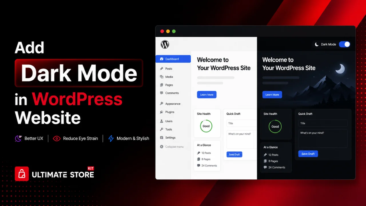
Many people browse websites late at night or in low-light environments. A bright screen can feel uncomfortable and may even cause eye strain. If your website only supports a light theme, some visitors may leave your site quickly because the reading experience feels too harsh.
This is why more website owners now want to learn how to add dark mode to their WordPress websites. Dark mode gives users a more comfortable viewing experience and also makes your website look modern and professional. It can improve user engagement, increase browsing time and create a better experience for mobile users.
The good news is that adding dark mode to WordPress is easier than most people think. You can use a plugin, custom CSS or built-in theme options to enable a smooth dark mode experience on your website.
In this guide, you will learn how to add dark mode to your WordPress website step by step. We will also cover dark mode plugins, customization settings, WooCommerce support and useful tips to improve your website design.
Why Dark Mode Has Become So Popular
Dark mode is a display setting that replaces the default light (white) backgrounds with darker tones; typically deep grays, charcoals or blacks, while adjusting text and other elements for proper contrast and readability.
Why Users Love Dark Mode
- Reduces eye strain: Staring at a bright white screen in a dimly lit room is harsh on the eyes. Dark mode softens the experience significantly.
- Saves battery life: On OLED and AMOLED screens, dark pixels are literally turned off, which means dark mode can save meaningful battery life on mobile devices.
- Looks modern and premium: Dark interfaces feel sophisticated and are associated with high-end apps and tools.
- Better for night-time browsing: Many users browse late at night and a blinding white screen is the last thing they want.
Why Dark Mode Is a Smart Choice for WordPress Websites
According to various studies and platform data, over 82% of smartphone users and more than 50% of desktop users have enabled dark mode on their operating systems. When a user visits your website with dark mode enabled on their device, they expect either an automatic dark mode or a toggle they can use.
If your site doesn’t offer dark mode, you risk:
- Higher bounce rates from users who find your bright site uncomfortable
- Poor user experience perception compared to competitors
- Missed accessibility opportunities
Adding dark mode is no longer optional; it’s a competitive advantage and a sign of user-centric design.
Methods to Add Dark Mode to WordPress
There are three main approaches:
- Using a WordPress Plugin: Easiest, no coding required
- Using CSS Custom Properties + JavaScript Toggle: Medium difficulty, full control
- Using the WordPress Theme Customizer / Child Theme: Best for developers who want deep integration
Let’s explore each method in detail.
Method 1: Add Dark Mode Using a WordPress Plugin
Adding dark mode to your WordPress website is simple when you use the right plugin and settings.
In this guide, we will use the Dark Reader plugin. It comes with both free and premium features to help you create a smooth and professional dark mode experience for your visitors.
Many dark mode plugins only add a simple dark toggle button. However, this plugin provides extra features like better color contrast, automatic scheduling and compatibility with popular page builders.
Now, let’s go through the setup process step by step.
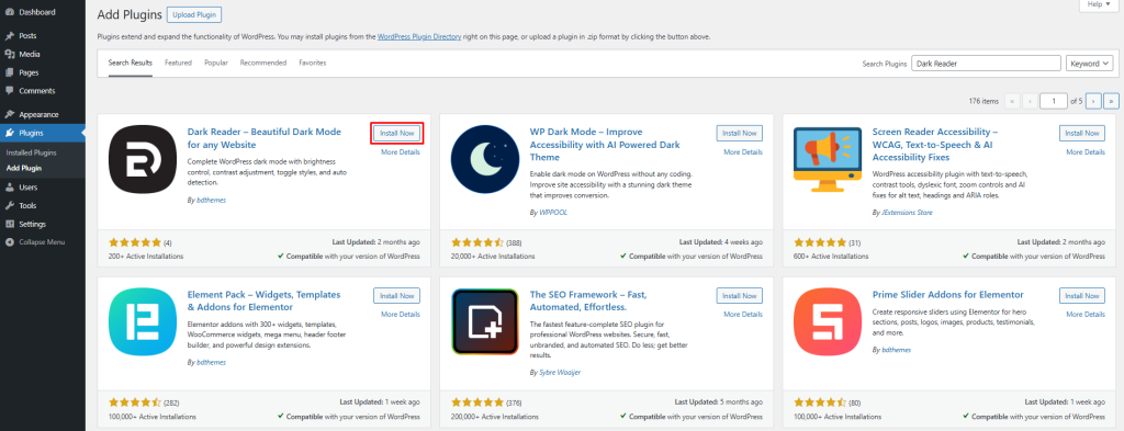
Step 1: Install the Dark Reader Plugin in WordPress
The Dark Reader plugin helps you quickly add dark mode to your WordPress website.
Follow these steps to install it:
Log in to your WordPress dashboard.
Go to Plugins → Add New.
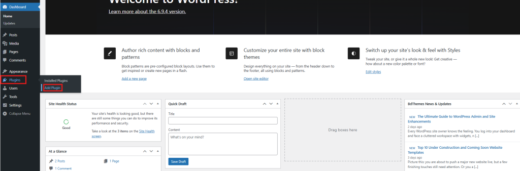
In the search box, type “Dark Reader”. Find the official plugin by BdThemes.
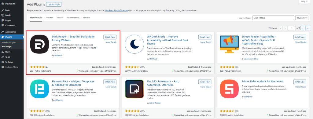
Click Install Now
After installation, click Activate
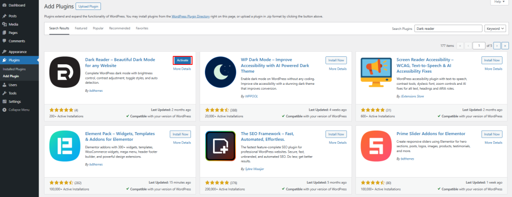
Once activated, you will see the plugin settings inside your WordPress dashboard under Settings → Dark Reader.
Some advanced features are available in the Pro version, so you can upgrade your plan if you need more customization and control options for dark mode.
If you need any help with the setup process, please watch the video below.
Dark Reader Pro for WordPress | Complete Installation & Customization Guide by BdThemes
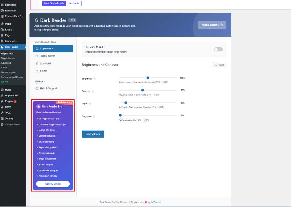
Step 2: Configure the Dark Reader Settings
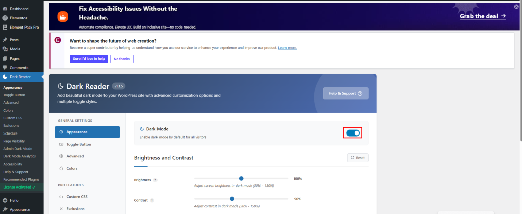
After activating the plugin, open the Dark Reader settings page from your WordPress dashboard.
Here, you can customize how dark mode looks and works on your website.
First, enable the Dark Mode option to activate dark mode for your visitors.
Below that, you will see several display settings:
In the Brightness and Contrast section, you can control how dark mode appears on your website.
Here, you can adjust:
- Brightness: Adjust between 50% – 150% to control the overall screen brightness in dark mode
- Contrast: Set between 50% – 150% to improve text clarity and visibility
- Sepia: Apply a warm color filter from 0% – 100% to reduce blue light
- Grayscale: Add a grayscale effect from 0% – 100% for a simpler viewing experience
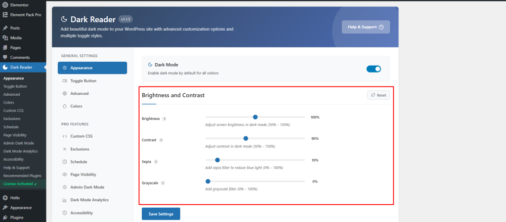
These settings help you customize the dark mode appearance while keeping your website clean and easy to read.
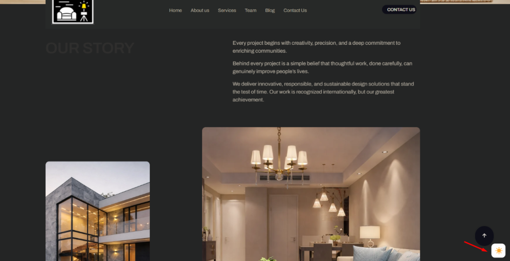
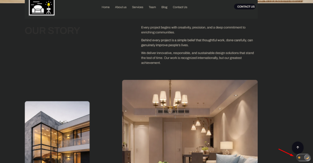
Step 3: Customize the Dark Mode Toggle Button
The toggle button allows visitors to switch between light mode and dark mode easily. You can customize both the button position and style to match your website design.
Choose the Toggle Button Position
First, choose where the dark mode button will appear on your website.
You can select different positions such as:
- Top Left: Easy to notice without covering content
- Top Right: A common position many users expect
- Bottom Left: A cleaner option for reading-focused websites
- Bottom Right: One of the most popular placements for WordPress websites
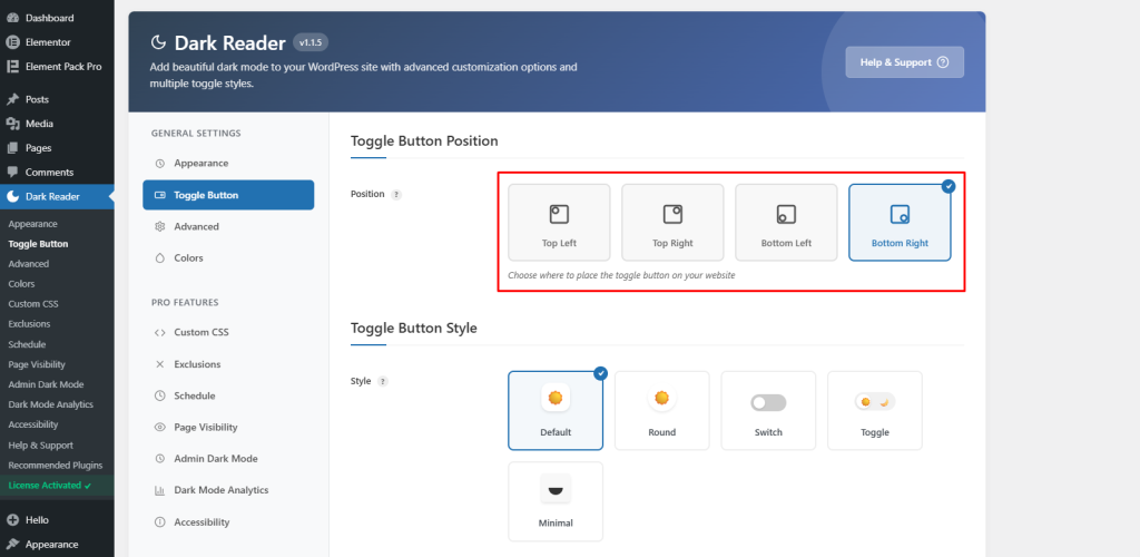
Choose the position that works best with your website layout.
Select a Toggle Button Style
The plugin includes several free toggle button styles.
Available free styles include:
- Default: Simple text-based toggle button
- Round: Circular button design
- Switch: Sliding switch style
- Toggle: Classic on/off button layout
- Minimal: Small icon-only design
The Pro version also includes extra toggle styles such as:
- Modern Slider: Smooth sliding animation
- Text Toggle: Clean text switching style
- FlipFlop Toggle: Animated flip effect
- iOS Toggle: Apple-inspired toggle design
- iOS Toggle Icon: Icon-based iOS style button
Select a style that matches your website branding and gives visitors a smooth switching experience between light and dark mode.
Step 4: Configure Smart Detection and Advanced Dark Mode Settings
The plugin also includes advanced settings that help improve the dark mode experience for your visitors. These features allow the website to automatically follow user preferences and apply dark mode more smoothly across different content types.
Enable System Color Scheme Detection
Turn on the Use System Color Scheme option to automatically detect your visitor’s device settings.
When this feature is enabled, your website will switch to dark mode automatically if the user already uses dark mode on their device or browser.
This creates a smoother and more user-friendly experience without requiring visitors to manually change the mode.
Configure Dark Mode for Different Content Types
You can also control how dark mode works with different types of website content.
Available options include:
- Enable for PDFs: Applies dark mode styling to embedded PDF documents
- Apply Immediately: Automatically applies dark mode to dynamic content loaded after the page opens
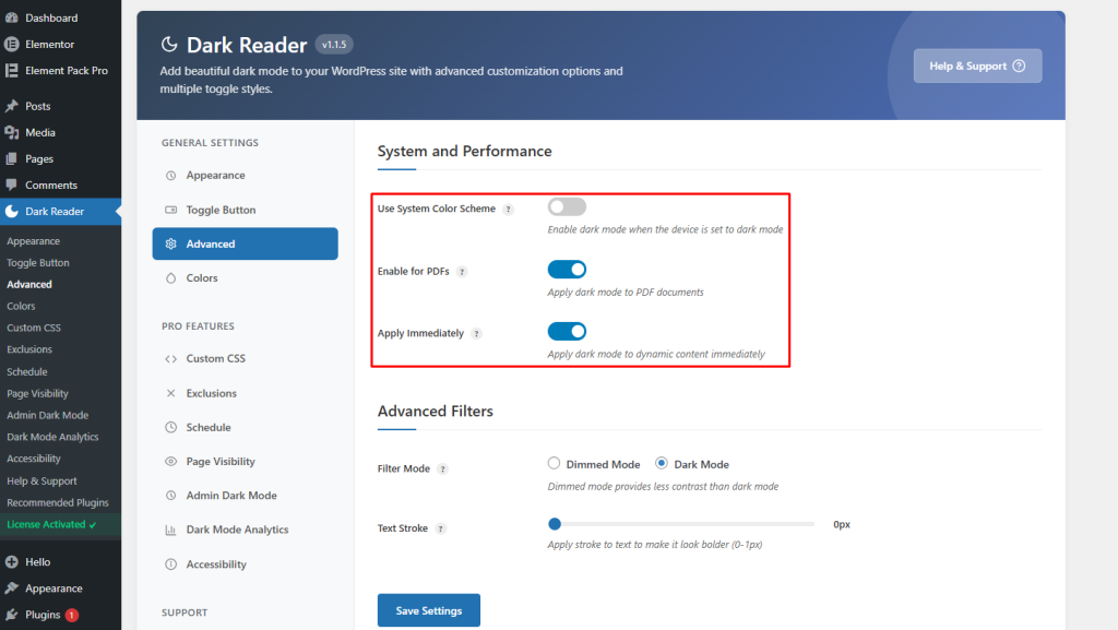
These settings help maintain a consistent dark mode appearance across your website.
Adjust Advanced Filter Settings
The plugin also provides filter options for better visual control.
You can choose between:
- Dimmed Mode: Adds a softer dark effect while keeping some original colors visible
- Dark Mode: Fully converts the website into a dark theme appearance
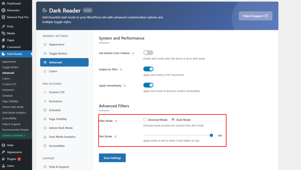
You can also enable Text Stroke to improve text readability, especially on websites with image backgrounds or complex designs.
Step 5: Customize Dark Mode Colors
You can also customize the dark mode color scheme to better match your website branding and design.
Open the Colors section from the Dark Reader settings panel.
Here, you can adjust:
- Background Color: Change the main background color used in dark mode
- Text Color: Set a custom text color for better readability
Click the Select Color button to choose your preferred colors.
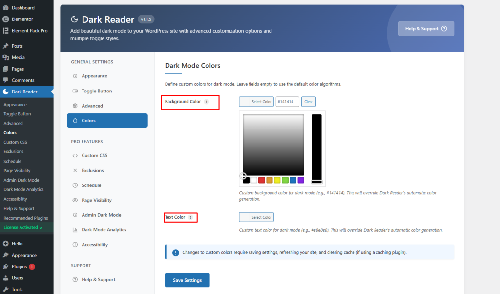
These settings allow you to create a more personalized dark mode appearance instead of using the default automatic colors.
Step 6: Add Custom CSS for Dark Mode
The plugin also allows you to add custom CSS for more advanced dark mode customization.
Open the Custom CSS section from the settings panel.
Here, you can add your own CSS code that will only work when dark mode is active. This helps you customize specific elements, colors, backgrounds, buttons, or text styles on your website.
The editor also includes:
- CSS Templates: Quickly insert ready-made CSS styles
- Insert Template: Add pre-designed dark mode CSS snippets
- Beautify CSS: Automatically format your CSS code for better readability
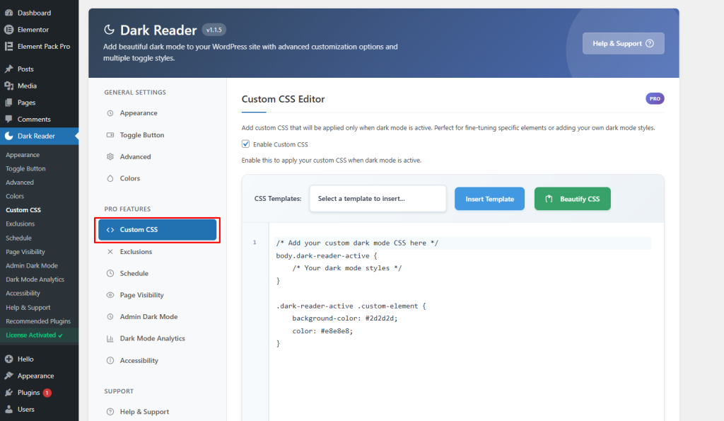
This feature is useful if you want more control over your dark mode design and appearance.
Please note that the Custom CSS feature is available in the Pro version of the plugin.
Step 7: Exclude Specific Elements From Dark Mode
The plugin also allows you to exclude certain elements from dark mode transformation.
Open the Exclusions section from the settings panel.
This feature is useful when you want to keep specific items in their original colors, such as:
- Website logos
- Images
- Videos
- Brand-colored sections
- Custom widgets
You can add CSS selectors to exclude these elements from dark mode.
Examples include:
.logo

#header-image

.brand-colors

.custom-widget
You can also switch between different tabs to manage exclusions for:
- CSS Selectors
- Images
- Videos
This helps maintain the original appearance of important design elements while the rest of the website uses dark mode.
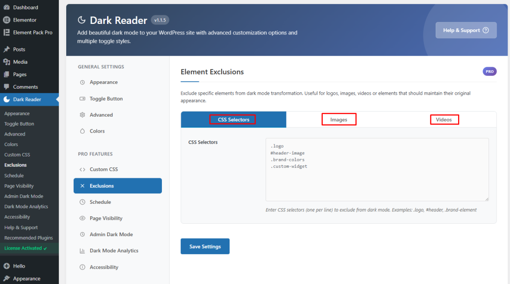
Note: The Exclusions feature is available in the Pro version of the plugin.
Step 8: Enable Smart Scheduling for Dark Mode
The plugin also includes a smart scheduling feature that can automatically enable or disable dark mode based on time settings.
Open the Schedule section from the settings panel.
Here, you can enable Scheduling to activate automatic dark mode scheduling.
You can then configure:
- Schedule Type: Choose how dark mode will be scheduled
- Start Time: Set the time when dark mode should automatically turn on
- End Time: Set the time when dark mode should automatically turn off
For example, you can automatically enable dark mode in the evening and disable it in the morning.
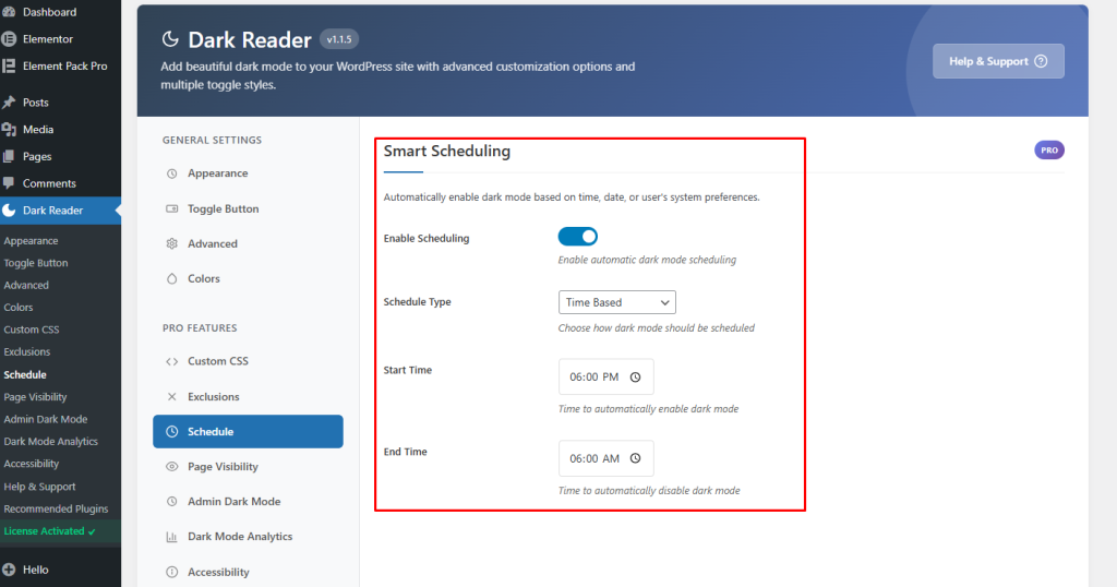
This feature helps create a more comfortable browsing experience for visitors during nighttime hours.
Please note that the Smart Scheduling feature is available in the Pro version of the plugin.
Step 9: Control Dark Mode Visibility on Specific Pages
The plugin also lets you control where dark mode appears on your website.
Open the Page Visibility section from the settings panel.
Inside the Visibility Mode option, you can choose how dark mode should be displayed across your website.
Available options include:
- Show on all pages: Enable dark mode across the entire website
- Show only on selected pages: Enable dark mode only on specific pages
- Hide on selected pages: Disable dark mode on selected pages only
- Hide on all pages: Completely disable dark mode on the website
This feature is useful when you want dark mode to appear only on certain pages, blog posts, or sections of your website.
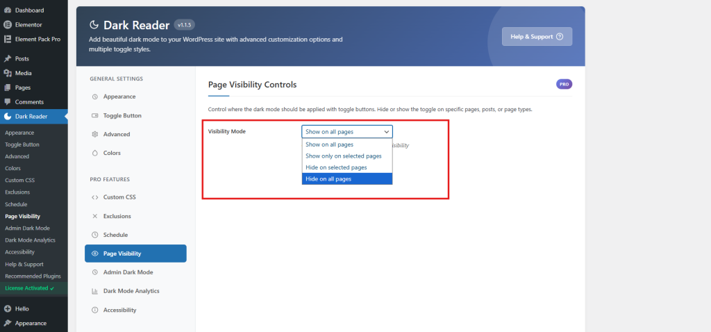
Please note that the Page Visibility feature is available in the Pro version of the plugin.
Step 10: Enable Dark Mode for the WordPress Admin Dashboard
The plugin also allows you to enable dark mode inside your WordPress admin dashboard.
Open the Admin Dark Mode section from the settings panel.
Here, you can turn on Enable Admin Dark Mode to apply dark mode styling to your WordPress dashboard area.
You can also customize:
- Admin Brightness: Adjust the dashboard brightness level
- Admin Contrast: Improve visibility and readability inside the admin panel
- Auto-detect User Preference: Automatically apply admin dark mode based on the user’s system settings
This feature helps create a more comfortable working experience, especially when managing your website during nighttime or low-light conditions.
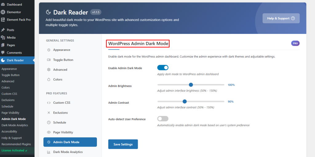
To enable Admin Dark Mode, you need the premium version of the plugin.
Congrats! It’s that simple to add dark mode using a WordPress dark mode plugin.
Bonus Tips 1: Enable Dark Mode Analytics
The plugin also includes a built-in analytics feature to track dark mode usage on your website.
Open the Dark Mode Analytics section from the settings panel.
Here, you can enable:
- Enable Analytics: Tracks how visitors use dark mode on your website
- Dashboard Widget: Displays dark mode analytics charts directly inside the WordPress dashboard
The analytics section also shows:
- Total dark mode users
- Visitor statistics
- Usage reports based on selected time periods
This feature helps you understand how many visitors prefer using dark mode on your website.
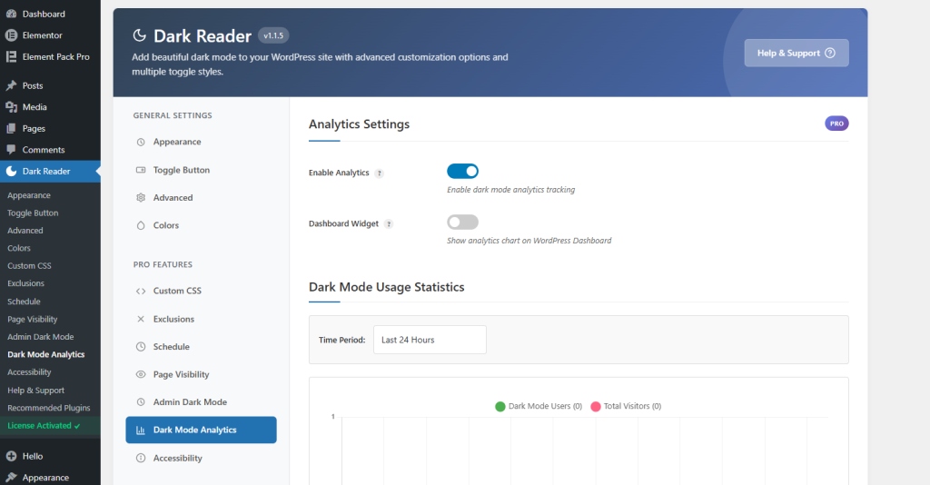
The Dark Mode Analytics option is available in the Pro version of the plugin.
Bonus Tips 2: Configure Accessibility Features
The plugin also includes accessibility features that make dark mode easier to control for users.
Open the Accessibility section from the settings panel.
Here, you can enable different accessibility options for dark mode.
URL Parameter Control
Turn on URL Parameter Control to enable or disable dark mode using a custom URL.
Examples:
- https://yoursite.com?mode=dark — Opens the website in dark mode
- https://yoursite.com?mode=light — Opens the website in light mode
This feature is useful for sharing direct dark mode or light mode links.
Keyboard Shortcut
You can also enable a keyboard shortcut for switching to dark mode quickly.
Visitors can press:
- Ctrl + Alt + D
to toggle between light mode and dark mode.
These accessibility features help improve user experience and make dark mode easier to use across your website.
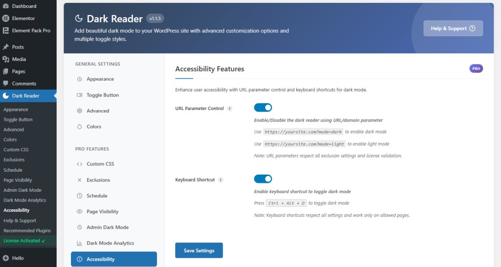
Note: The Accessibility settings are available in the Pro version of the plugin.
Method 2: Add Dark Mode with Custom CSS and JavaScript
If you want complete control over how dark mode looks on your site without relying on a plugin, this is the method for you. This approach uses CSS custom properties (variables) and a small JavaScript snippet.
Step 1: Understand How CSS Custom Properties Work
CSS custom properties (also called CSS variables) allow you to define values once and reuse them throughout your stylesheet. When the user switches to dark mode, you simply change those variable values and the entire site updates instantly.
Here’s a basic example:
:root {

  --bg-color: #ffffff;

  --text-color: #111111;

  --card-bg: #f5f5f5;

  --border-color: #e0e0e0;

}

body.dark-mode {

  --bg-color: #1a1a2e;

  --text-color: #e0e0e0;

  --card-bg: #16213e;

  --border-color: #333355;

}

body {

  background-color: var(--bg-color);

  color: var(--text-color);

}
When you add the class dark-mode to the <body> element, all the variables update simultaneously — changing your entire site’s color scheme instantly.
Step 2: Add CSS to Your WordPress Theme
Option A: Through the WordPress Customizer
- Go to Appearance → Customize
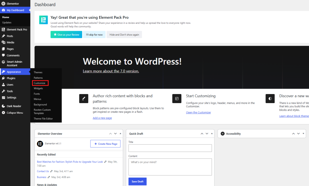
- Click on Additional CSS
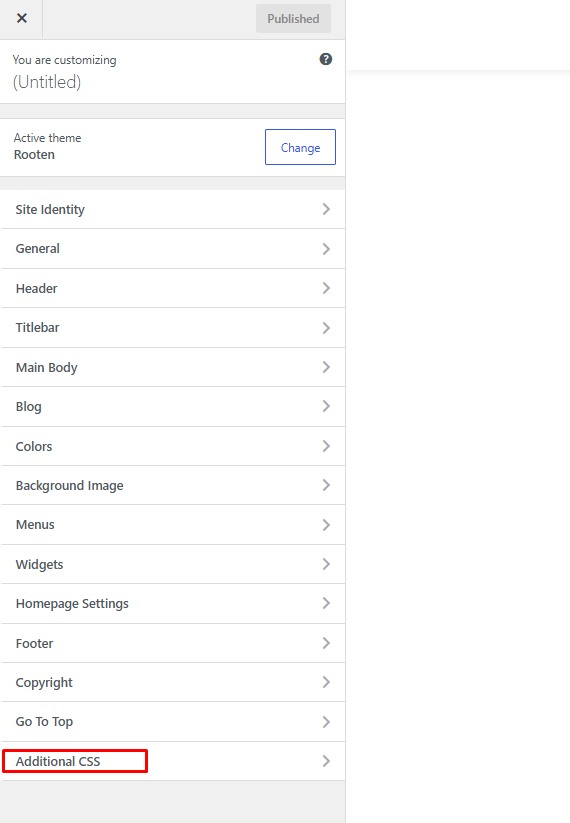
- Paste your dark mode CSS
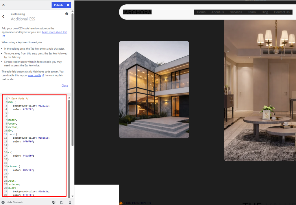
/* Dark Mode */

body {

    background-color: #121212;

    color: #ffffff;

}

header,

footer,

section,

div,

.card {

    background-color: #1e1e1e;

    color: #ffffff;

}

a {

    color: #4da6ff;

}

a:hover {

    color: #80c1ff;

}

input,

textarea,

select {

    background-color: #2a2a2a;

    color: #ffffff;

    border: 1px solid #444;

}

button {

    background-color: #333;

    color: #fff;

    border: 1px solid #555;

}

button:hover {

    background-color: #444;

}

table {

    background-color: #1e1e1e;

    color: #fff;

}

th,

td {

    border: 1px solid #444;

}
Option B: Through a Child Theme
If you’re using a child theme (recommended), add the CSS to your child theme’s style.css file.
Here’s a comprehensive dark mode CSS to get you started:
/* ===== LIGHT MODE (DEFAULT) ===== */

:root {

  --bg-primary: #ffffff;

  --bg-secondary: #f8f9fa;

  --bg-card: #ffffff;

  --text-primary: #212529;

  --text-secondary: #6c757d;

  --text-muted: #adb5bd;

  --border-color: #dee2e6;

  --link-color: #0d6efd;

  --heading-color: #111111;

  --shadow: 0 2px 8px rgba(0, 0, 0, 0.1);

  --input-bg: #ffffff;

  --input-border: #ced4da;

  --button-bg: #0d6efd;

  --button-text: #ffffff;

  --nav-bg: #ffffff;

  --footer-bg: #f8f9fa;

  --code-bg: #f4f4f4;

}

/* ===== DARK MODE ===== */

body.dark-mode {

  --bg-primary: #121212;

  --bg-secondary: #1e1e1e;

  --bg-card: #1e1e1e;

  --text-primary: #e0e0e0;

  --text-secondary: #a0a0a0;

  --text-muted: #6c757d;

  --border-color: #333333;

  --link-color: #6ea8fe;

  --heading-color: #ffffff;

  --shadow: 0 2px 8px rgba(0, 0, 0, 0.5);

  --input-bg: #2a2a2a;

  --input-border: #444444;

  --button-bg: #0d6efd;

  --button-text: #ffffff;

  --nav-bg: #1a1a1a;

  --footer-bg: #1a1a1a;

  --code-bg: #2a2a2a;

}

/* Apply variables to elements */

body {

  background-color: var(--bg-primary);

  color: var(--text-primary);

  transition: background-color 0.3s ease, color 0.3s ease;

}

h1, h2, h3, h4, h5, h6 {

  color: var(--heading-color);

}

a {

  color: var(--link-color);

}

p {

  color: var(--text-primary);

}

.site-header, header, nav {

  background-color: var(--nav-bg);

  border-bottom: 1px solid var(--border-color);

}

.site-footer, footer {

  background-color: var(--footer-bg);

  border-top: 1px solid var(--border-color);

  color: var(--text-secondary);

}

.card, .widget, .post-thumbnail, article {

  background-color: var(--bg-card);

  border: 1px solid var(--border-color);

  box-shadow: var(--shadow);

}

input, textarea, select {

  background-color: var(--input-bg);

  border-color: var(--input-border);

  color: var(--text-primary);

}

code, pre {

  background-color: var(--code-bg);

  color: var(--text-primary);

}

/* Dark mode toggle button */

#dark-mode-toggle {

  position: fixed;

  bottom: 30px;

  right: 30px;

  width: 50px;

  height: 50px;

  border-radius: 50%;

  border: none;

  cursor: pointer;

  background: var(--button-bg);

  color: var(--button-text);

  font-size: 20px;

  box-shadow: 0 4px 12px rgba(0, 0, 0, 0.3);

  z-index: 9999;

  transition: transform 0.2s ease, box-shadow 0.2s ease;

  display: flex;

  align-items: center;

  justify-content: center;

}

#dark-mode-toggle:hover {

  transform: scale(1.1);

  box-shadow: 0 6px 20px rgba(0, 0, 0, 0.4);

}
Step 3: Add the Toggle Button HTML
You need a button that users can click to toggle dark mode. Add this to your theme’s header.php or footer, or inject it via JavaScript.
Via functions.php (recommended):
function add_dark_mode_toggle() {
echo '<button id="dark-mode-toggle" aria-label="Toggle Dark Mode">🌙</button>';
}
add_action('wp_footer', 'add_dark_mode_toggle');
Step 4: Add the JavaScript
This is the core logic. It toggles the dark-mode class on the body, saves the user’s preference in localStorage and auto-applies it on page load.
Create a file called dark-mode.js in your theme’s folder and enqueue it, or add it via the Customizer’s Additional CSS section using a <script> tag workaround. Better yet, enqueue it properly:
// In functions.php

function enqueue_dark_mode_script() {

  wp_enqueue_script(

    'dark-mode',

    get_stylesheet_directory_uri() . '/js/dark-mode.js',

    array(),

    '1.0.0',

    true

  );

}

add_action('wp_enqueue_scripts', 'enqueue_dark_mode_script');
(function () {

  const toggle = document.getElementById('dark-mode-toggle');

  const body = document.body;

  const STORAGE_KEY = 'darkMode';

  // Check saved preference or system preference

  function getPreference() {

    const saved = localStorage.getItem(STORAGE_KEY);

    if (saved !== null) return saved === 'true';

    return window.matchMedia('(prefers-color-scheme: dark)').matches;

  }

  // Apply dark mode

  function applyDarkMode(isDark) {

    if (isDark) {

      body.classList.add('dark-mode');

      toggle.textContent = '☀️';

      toggle.setAttribute('aria-label', 'Switch to Light Mode');

    } else {

      body.classList.remove('dark-mode');

      toggle.textContent = '🌙';

      toggle.setAttribute('aria-label', 'Switch to Dark Mode');

    }

  }

  // Initialize

  applyDarkMode(getPreference());

  // Toggle on click

  toggle.addEventListener('click', function () {

    const isDark = body.classList.contains('dark-mode');

    localStorage.setItem(STORAGE_KEY, !isDark);

    applyDarkMode(!isDark);

  });

  // Listen for OS-level changes

  window.matchMedia('(prefers-color-scheme: dark)').addEventListener('change', function (e) {

    if (localStorage.getItem(STORAGE_KEY) === null) {

      applyDarkMode(e.matches);

    }

  });

})();
Step 5: Prevent Flash of Unstyled Content (FOUC)
One common problem with dark mode implementations is a “flash”, where the page briefly shows the light mode before switching to dark. To fix this, add an inline script in your <head> that applies the dark class before the page renders:
// In functions.php
function dark_mode_early_script() {
echo '<script>
(function() {
var saved = localStorage.getItem("darkMode");
var prefersDark = window.matchMedia("(prefers-color-scheme: dark)").matches;
if (saved === "true" || (saved === null && prefersDark)) {
document.documentElement.classList.add("dark-mode");
}
})();
</script>';
}
add_action('wp_head', 'dark_mode_early_script', 1);
Note: Apply the class to document.documentElement (the <html> tag) here and update your CSS to use html.dark-mode body or html.dark-mode selectors accordingly.
Method 3: Using Theme Support and the Customizer
Many modern WordPress themes especially those built on the Full Site Editing (FSE) framework or using the block editor, have built-in dark mode support or color palette customization that you can leverage.
Checking Your Theme’s Built-In Support
- Go to Appearance → Customize
- Look for a Colors or Global Styles section
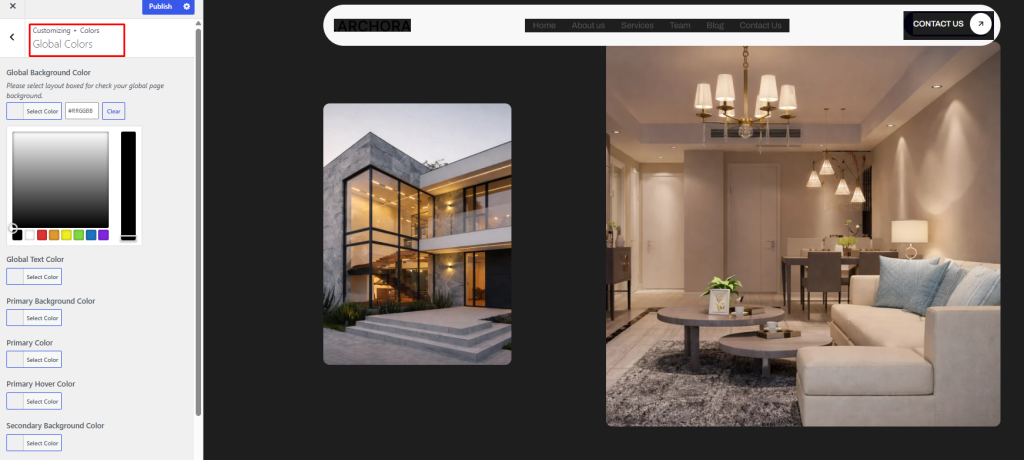
- Some themes offer a dark color palette option right there
If your theme supports theme.json (block themes), you can define dark mode color palettes directly in that file.
Using theme.json for Block Themes
For WordPress block themes, theme.json is the configuration file. Here’s how you can add a dark color palette:
{

  "version": 2,

  "settings": {

    "color": {

      "palette": [

        {

          "slug": "background",

          "color": "#ffffff",

          "name": "Background"

        },

        {

          "slug": "foreground",

          "color": "#111111",

          "name": "Foreground"

        }

      ]

    }

  },

  "styles": {

    "color": {

      "background": "var(--wp--preset--color--background)",

      "text": "var(--wp--preset--color--foreground)"

    }

  }

}
You can then combine this with a custom CSS media query for prefers-color-scheme: dark to automatically serve dark styles when the OS is in dark mode.
Handling Images in Dark Mode
One challenge with dark mode is images. A bright image on a dark background can look jarring. Here are two approaches:
CSS Filter Approach
Apply a subtle filter to images in dark mode to reduce their brightness slightly:
body.dark-mode img {

  filter: brightness(0.85) contrast(1.05);

  transition: filter 0.3s ease;

}
This reduces harshness without making images look wrong.
Swapping Images Entirely
For logos and icons (especially those with white backgrounds), you might want to swap them for dark-friendly versions:
body.dark-mode .site-logo img {

  content: url('/path/to/logo-dark.png');

}
Or use the <picture> element with a prefers-color-scheme media query in your theme templates.
Dark Mode and WooCommerce
If you run a WooCommerce store, dark mode needs special attention because WooCommerce adds many of its own styles for product cards, cart pages, checkout forms and more.
Key WooCommerce Elements to Style
body.dark-mode .woocommerce .product,

body.dark-mode .woocommerce ul.products li.product {

  background: var(--bg-card);

  border-color: var(--border-color);

}

body.dark-mode .woocommerce-cart table.cart td,

body.dark-mode .woocommerce-checkout form .form-row input {

  background: var(--input-bg);

  color: var(--text-primary);

  border-color: var(--input-border);

}

body.dark-mode .woocommerce .price,

body.dark-mode .woocommerce ins .amount {

  color: var(--link-color);

}

body.dark-mode .woocommerce-message,

body.dark-mode .woocommerce-info {

  background: var(--bg-secondary);

  border-top-color: var(--link-color);

  color: var(--text-primary);

}
The WP Dark Mode Pro plugin handles WooCommerce dark mode automatically, which is one of the strongest reasons to consider the premium version.
Advanced Tips
If you run a WooCommerce website, adding dark mode can improve the overall shopping experience for your visitors. Many users browse online stores at night and a dark interface makes product pages easier to view while reducing eye strain.
Dark mode can also help your store look more modern and professional. It works especially well for:
- Fashion stores
- Electronics websites
- Gaming shops
- Digital product stores
- Technology brands
To create a more advanced and visually attractive WooCommerce website, you can also use StoreKit Pro. It comes with powerful Elementor WooCommerce widgets, custom product layouts, checkout page builders, account page customization, product grids, carousels and many other eCommerce features.
Combining dark mode with StoreKit Pro can help you build a modern online store with better design, smoother user experience and improved customer engagement.
Best Practices for WordPress Dark Mode
1. Respect the System Preference by Default
Use the CSS media query prefers-color-scheme: dark as a baseline so that users who have dark mode enabled on their OS get a dark site automatically, without having to click a toggle.
@media (prefers-color-scheme: dark) {

  :root {

    --bg-primary: #121212;

    --text-primary: #e0e0e0;

    /* ... other variables ... */

  }

}
2. Always Provide a Manual Toggle
Not every user who visits your site will have OS-level dark mode and some users might want to override their system settings. Always give them a visible, accessible toggle button.
3. Maintain WCAG Contrast Ratios
Dark mode doesn’t mean low contrast. Make sure your text-to-background contrast ratio meets WCAG AA standards (at least 4.5:1 for normal text). Use tools like the WebAIM Contrast Checker to verify.
4. Save User Preference
Use localStorage to remember the user’s preference so they don’t have to re-toggle every time they visit a new page.
5. Smooth Transitions
Add CSS transitions to prevent jarring color flips:
body {

  transition: background-color 0.3s ease, color 0.3s ease;

}
6. Test Across Devices and Browsers
Dark mode can look different across browsers (Chrome, Firefox, Safari) and devices. Always test your dark mode implementation thoroughly.
7. Don’t Forget Form Elements
Inputs, selects, textareas and buttons often retain default browser styling that clashes with dark mode. Always explicitly style these elements.
8. Handle Third-Party Embeds
Embedded content (YouTube videos, Twitter posts, Google Maps) usually doesn’t respect your dark mode. Consider adding a border or wrapper with a dark background to reduce the contrast clash.
Testing Your Dark Mode Implementation
Before going live, here’s a testing checklist:
Visual Testing:
- [ ] All text is readable against dark backgrounds
- [ ] Links are visible and distinguishable
- [ ] Images don’t look jarring
- [ ] Buttons have clear contrast
- [ ] Forms are usable and readable
- [ ] Navigation is clear in dark mode
- [ ] Footer looks correct
- [ ] Cards and widgets are properly styled
Functional Testing:
- [ ] Toggle button works correctly
- [ ] Preference is saved on page refresh
- [ ] Preference persists across multiple pages
- [ ] System preference is detected automatically
- [ ] No flash of unstyled content on load
Responsive Testing:
- [ ] Dark mode works on mobile devices
- [ ] Toggle button is accessible on small screens
- [ ] No layout breaks in dark mode
Accessibility Testing:
- [ ] Contrast ratios pass WCAG AA
- [ ] Toggle button has proper aria-label
- [ ] Keyboard navigation works with the toggle
Common Dark Mode Problems and Fixes
Problem: White Flash on Page Load
Fix: Add the early inline script in <head> that applies the dark class before CSS renders (covered in Step 5 above).
Problem: Some Elements Still Show White Background
Fix: These are likely elements with hardcoded background colors in the theme’s CSS. Use browser DevTools to inspect them and add specific overrides.
@media (prefers-color-scheme: dark) {
  :root {
    --bg-primary: #121212;
    --text-primary: #e0e0e0;
    /* ... other variables ... */
  }
}
Problem: Dark Mode Doesn’t Work on Plugin-Generated Content
Fix: Inspect the plugin’s elements and write targeted CSS. For widely-used plugins like Contact Form 7 or Elementor, search for “plugin-name dark mode CSS” for community solutions.
Problem: Images Look Too Bright
Fix: Apply filter: brightness(0.85) to images in dark mode as described earlier.
Problem: Toggle Doesn’t Remember Preference
Fix: Make sure your JavaScript correctly saves to and reads from localStorage. Also ensure no caching plugin is interfering.
Performance Considerations
Adding dark mode should not slow down your website. Here are tips to keep it performant:
- Avoid large JavaScript libraries: A small vanilla JS snippet (like the one in Method 2) is all you need
- Use CSS variables: They’re far more performant than JavaScript-based color manipulation
- Minimize DOM queries: Don’t query elements on every toggle; use class changes on <body> instead
- Lazy-load heavy plugin features: If using a plugin, disable any features you don’t need
FAQs About How to Add Dark Mode to Your WordPress Website
1. What is dark mode in WordPress?
Dark mode is a display setting that changes your website background to dark colors while keeping text light for better readability. It helps reduce eye strain and gives your website a modern appearance.
2. Why should I add dark mode to my WordPress website?
Adding dark mode improves user experience, especially for visitors browsing at night. It can also make your website look more professional and help users stay longer on your site.
3. Can I add dark mode to WordPress without coding?
Yes, you can easily add dark mode using WordPress plugins like Dark Reader or WP Dark Mode without writing any code.
4. Which is the best dark mode plugin for WordPress?
Popular dark mode plugins include Dark Reader, WP Dark Mode and Darklup. These plugins offer dark mode toggles, scheduling and customization features.
5. Does dark mode work with Elementor websites?
Yes, most dark mode plugins support Elementor websites. You can also customize dark mode sections directly inside Elementor.
6. Can I enable dark mode for WooCommerce stores?
Yes, dark mode works well with WooCommerce stores. It can improve the shopping experience by making product pages easier to browse in low-light environments.
7. Will dark mode slow down my WordPress website?
Most lightweight dark mode plugins have little impact on website speed. Using optimized plugins and clean code helps maintain good performance.
8. Can visitors switch between light mode and dark mode?
Yes, most dark mode plugins include a toggle button that lets users switch between light and dark themes anytime.
9. Does dark mode improve SEO?
Dark mode is not a direct SEO ranking factor. However, it can improve user experience, reduce bounce rates and increase visitor engagement, which may help your website performance.
10. Can I customize dark mode colors on my website?
Yes, many dark mode plugins allow you to customize background colors, text colors, button styles and other design elements to match your website branding.
Conclusion
Adding dark mode to your website is a simple way to improve user experience and give your WordPress site a modern look. Many users now prefer dark themes because they reduce eye strain and make browsing more comfortable, especially at night.
After reading this guide, you now understand how to add dark mode to your WordPress website using plugins, custom CSS and advanced customization settings. You also learned how to configure toggle buttons, scheduling options, accessibility features and WooCommerce dark mode support.
If you want the easiest setup, a dark mode plugin can help you activate everything in just a few clicks. If you need more control, you can customize colors, layouts and styles to match your website branding.
A well-designed dark mode can make your website look cleaner, more professional and more user-friendly. Take some time to test your design on different devices and browsers so visitors can enjoy the best possible experience.
Did you find this guide helpful? Share it with fellow WordPress users and let us know in the comments which method worked best for you!