


Your WordPress slider might look great, but without carousel indicators, visitors have no idea how many slides exist or where they are.
That single navigation gap causes users to miss content, lose interest, and leave. According to research by Erik Runyon, the first slide in a carousel captures around 40% of all clicks, while later slides receive minimal interaction.
Carousel indicators provide users with visible navigation cues that keep them engaged throughout every slide.
In this guide, you will learn how to add carousel indicators in WordPress, customize their appearance, and build sliders that actually hold attention.
What Are Carousel Indicators?
Carousel indicators are the small navigational elements attached to a slider that tell users two things: how many slides exist and which one they are currently on.
They remove the guesswork from browsing a multi-slide section, whether that is a hero banner, a WordPress testimonial carousel, or a product showcase.
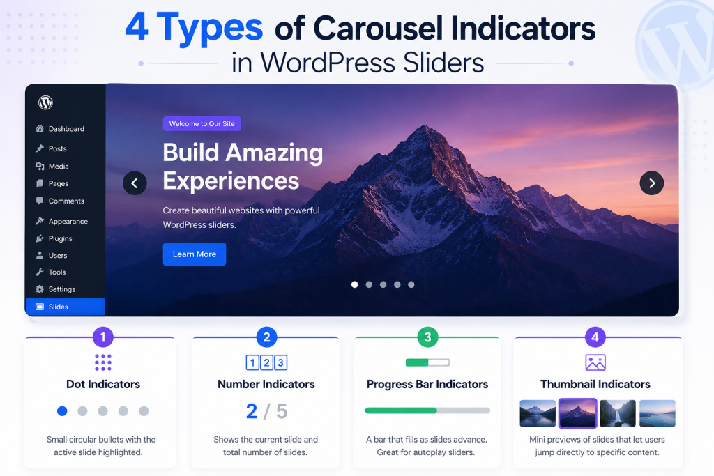
The four most common types you will encounter on WordPress sites are:
- Dot indicators: Small circular bullets below or above the slider, with the active slide highlighted in a different color or size. The most widely used format and works across nearly every slider context.
- Number indicators: Displays a count like “2 / 5” rather than a visual symbol. Best for content-heavy or sequential sliders where order matters.
- Progress bar indicators: A horizontal bar that fills as slides advance. Works especially well on autoplay sliders and promotional banners where pacing is part of the experience.
- Thumbnail indicators: Miniature previews of each slide that allow users to jump directly to specific content. Ideal for image galleries, portfolios, and lookbooks.
Each type serves a different context. Choosing the right one depends on what your slider displays and the amount of screen space you have available.
Why Carousel Indicators Matter for User Experience
Navigation clarity directly affects whether visitors engage with your slider content or scroll past it entirely.
The Baymard Institute notes that 75% of sites using a homepage image carousel fail to implement it correctly, often resulting in missed content and a worse overall experience.
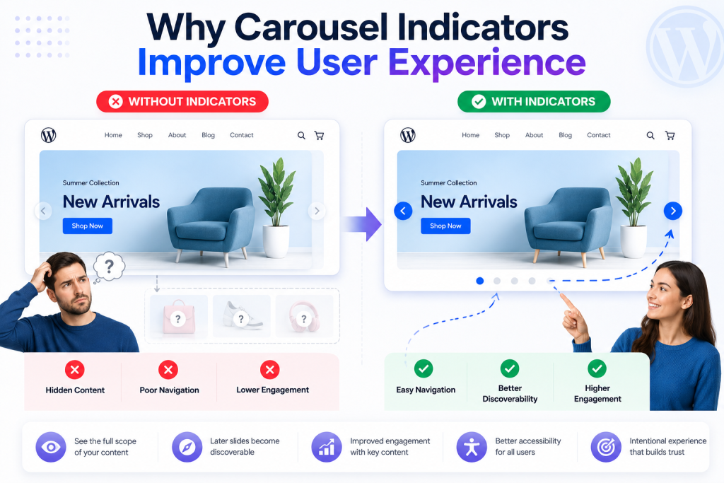
A WordPress image carousel without navigation indicators is effectively invisible: visitors do not know there are more slides, so they do not look for them.
Adding slider indicators on the WordPress side addresses several problems at once:
- Users can see the full scope of your content before interacting
- Later slides become discoverable instead of hidden
- Engagement with promotional or testimonial content improves
- Accessibility improves because indicators provide a structural context for screen readers
- The WordPress carousel slider feels intentional rather than accidental
For e-commerce sites specifically, a WordPress content carousel without indicators on a product showcase or testimonial section wastes conversion potential.
Every slide a visitor misses is a product feature, social proof piece, or CTA that never got seen.
If you are building or improving a WooCommerce store, the guide on designing a WooCommerce store with Elementor explains how slider and carousel elements fit into the bigger picture of store design.
Different Types of Carousel Indicators in WordPress
Not all carousel indicators work the same way, and the right format depends on what your slider is doing. Here is a breakdown of the four main types and where each one fits best.
Dot Indicators
Dot indicators are the default choice for most image slider indicators. They are unobtrusive, immediately understood by users, and work well across all device sizes. For hero sections, brand sliders, and general WordPress carousel slider layouts, dots are almost always the right call.
Number Indicators
If your slider content is sequential or comparative, numbered carousel pagination provides users with more useful information than a single symbol. A label like “Slide 3 of 7” provides concrete context, making this format a strong fit for blog post carousels, tutorial sliders, and step-based content.
Progress Bar Indicators
Progress bars fill horizontally as slides play, giving them a more cinematic feel. They work best on autoplay-driven layouts where content flows on its own rhythm, such as promotional banners and storytelling sections.
Thumbnail Indicators
When visual recognition matters more than slide numbers, thumbnail indicators let users jump directly to what they want. This format works best for portfolio galleries, product image carousels, and any situation where seeing a small preview is faster than reading a label.
Prerequisites
Setting up carousel indicators in WordPress does not require any coding, but you need a couple of plugins installed before you start. Make sure the following are ready before moving on to the steps:
- WordPress installed and running
- Elementor installed and activated
- Prime Slider installed and activated
How to Install Prime Slider
If you have not installed Prime Slider yet, the process is straightforward from the WordPress admin dashboard:
- Log in to your WordPress dashboard
- Go to Plugins, then click Add Plugin
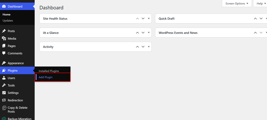
- Search for Prime Slider in the plugin search bar
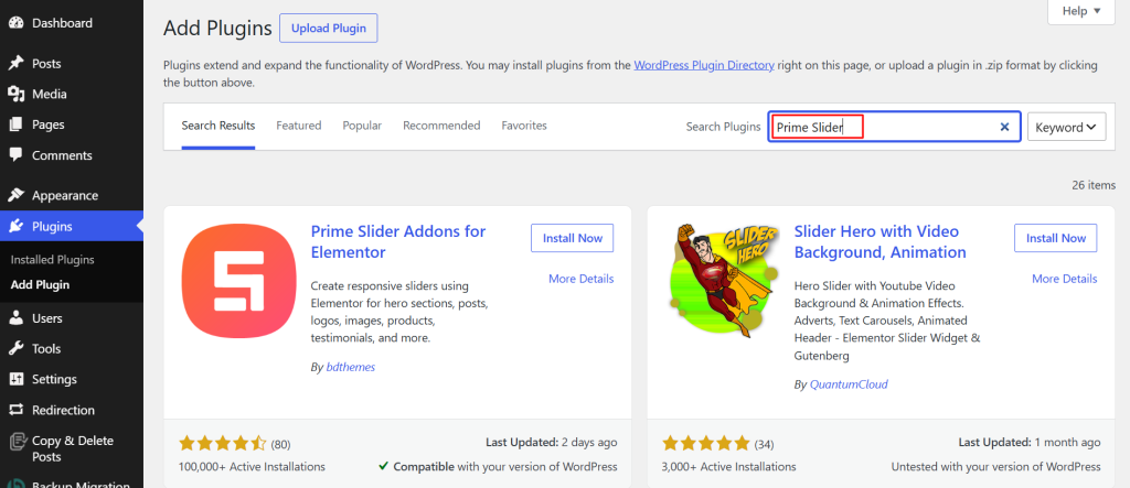
- Click Install Now once the plugin appears
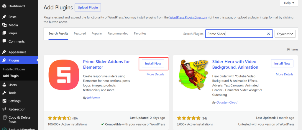
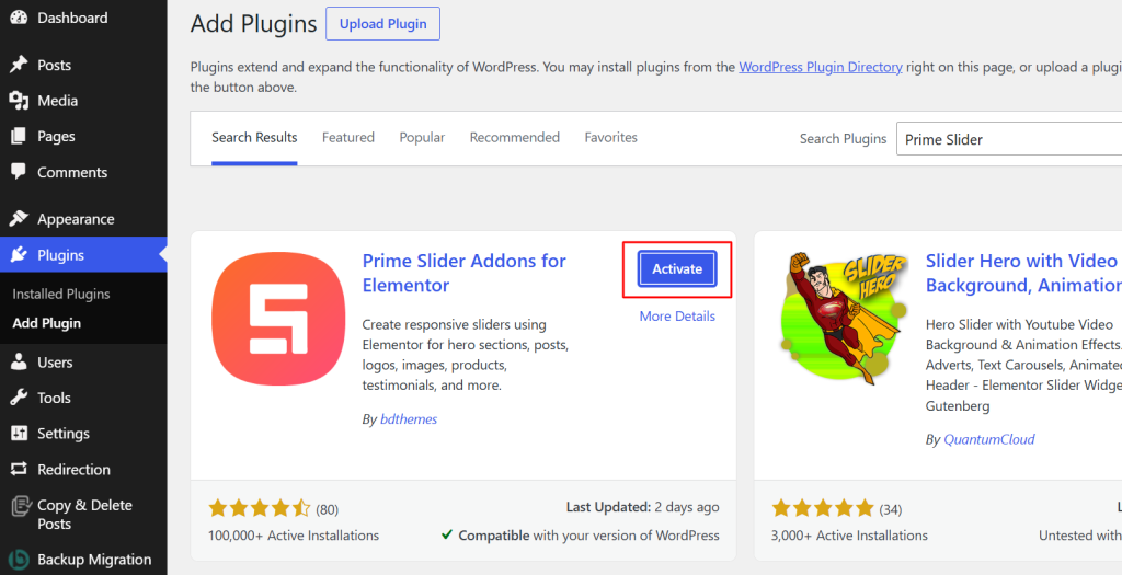
- Click Activate once the installation completes
For a more detailed walkthrough, especially if you are setting up the Pro version, check out the Prime Slider installation and activation guide.
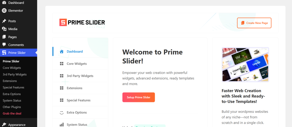
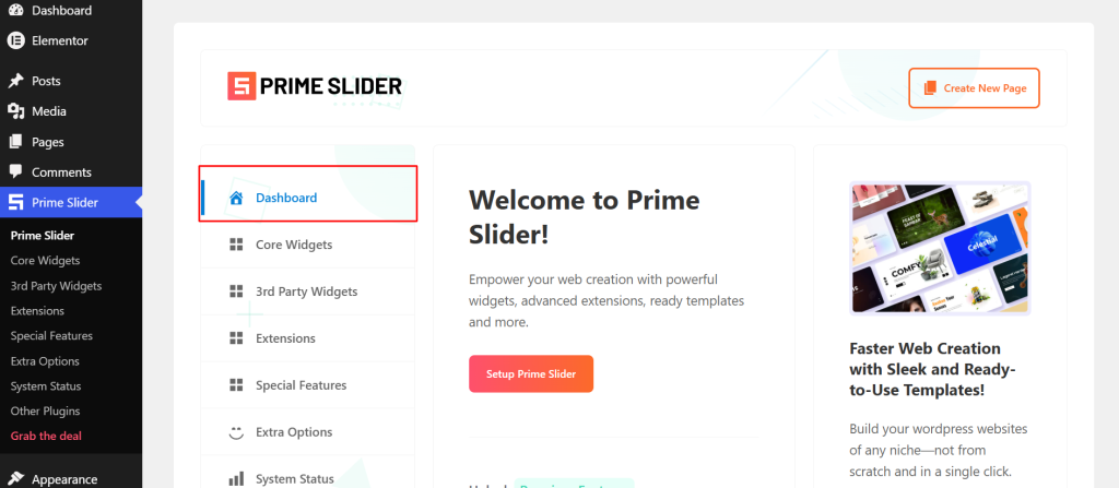
After activation, open the Prime Slider dashboard from the WordPress sidebar to confirm everything is active and ready.
What Is Prime Slider?

Prime Slider is a dedicated Elementor slider addon built by BdThemes.
It adds 50+ specialized slider widgets directly inside Elementor, covering hero sliders, post sliders, product sliders, image sliders, video sliders, WordPress testimonial carousels, and more.
Every widget is built on Swiper, includes responsive controls, and offers per-widget pagination styling options. For anyone building a WordPress carousel slider or any kind of multi-slide section in Elementor, Prime Slider removes the limitations of what Elementor provides out of the box and gives you full control over how indicators look and behave without writing any code.
If you are still evaluating which Elementor slider plugin is the right fit for your setup, the 10 Best Elementor Slider Plugins post on the Ultimate Store Kit blog compares Prime Slider with other popular options based on features, pricing, and performance.
How to Create Carousel Indicators in WordPress Using Prime Slider
With Prime Slider installed and Elementor ready, the process of adding WordPress carousel indicators comes down to 6 steps: enabling a widget, building your page, adding slides, enabling pagination, and styling the indicators to match your design. Here is how each step works.
Step 1: Enable the Slider Widget
Prime Slider widgets must be enabled individually before they appear in Elementor. This gives you a lighter plugin footprint by only loading the widgets you actually use.
- From the WordPress dashboard, open the Prime Slider plugin dashboard
- Click the Core Widgets tab
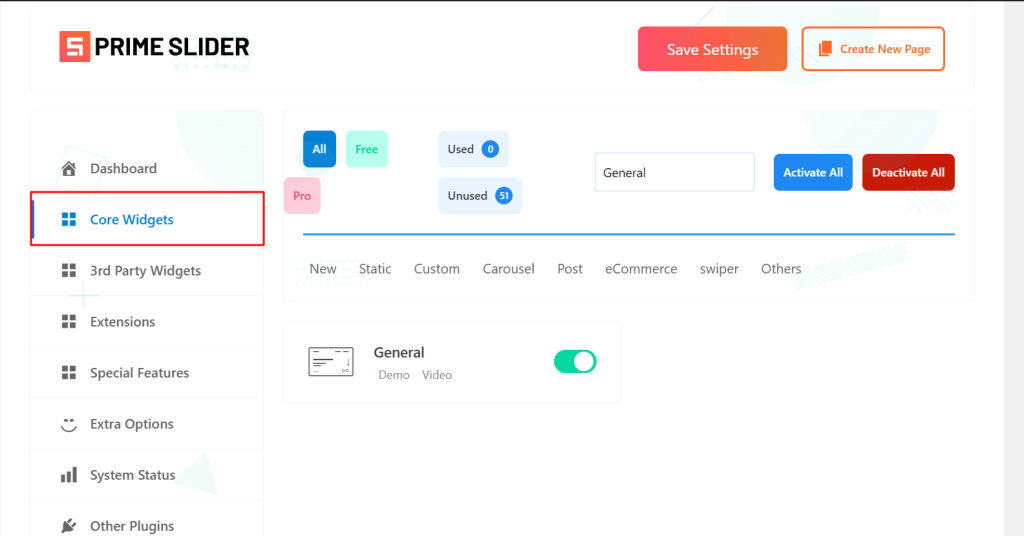
- Search for the widget you want to use (the General Slider is the best starting point for beginners)

- Toggle it on

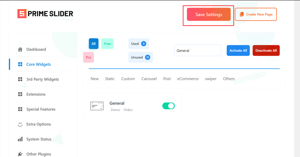
- Click Save Settings
For a full list of available widgets and what each one does, the Prime Slider knowledge base is a good reference to keep open as you work through this.
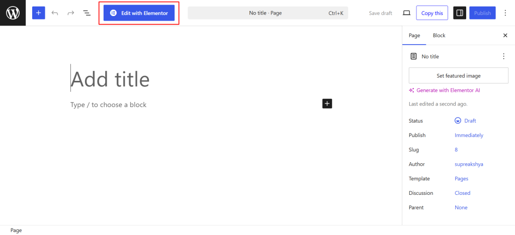
Step 2: Create or Edit a Page with Elementor
With your widget enabled, open the page where the slider will live.
- Open an existing page or create a new one from Pages in your dashboard
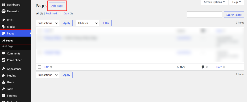
- Click Edit with Elementor to launch the visual editor
- Add a new section by clicking the plus icon if starting fresh
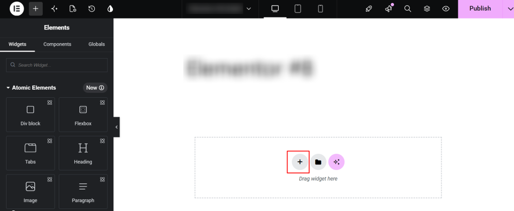
Step 3: Add a Prime Slider Widget
Once you are inside the Elementor editor, finding and placing your slider widget takes just a few seconds.
- In the Elementor panel on the left, search for the slider widget you enabled.
- Drag and drop it onto the page.
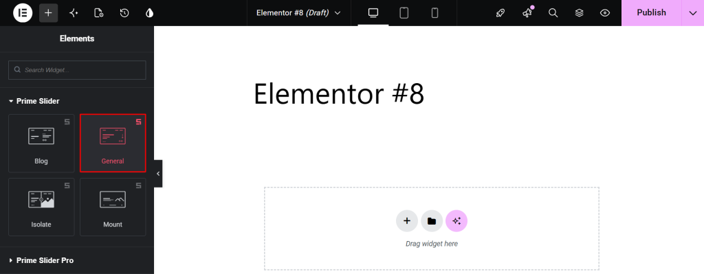
Three solid options depending on your use case:
- General Slider: Best for beginners. Supports four skins (Default, Slide, Crelly, Meteor) and is suitable for hero sections, landing pages, and marketing banners. Full pagination controls included.

- Monster Slider: Good for image-heavy pages. Supports Carousel and Coverflow layouts, with Color, Active Color, and Size controls for the WordPress slider dots built right in.

- Panorama Slider: Best for advanced use. Offers the most granular Elementor carousel indicators controls in the library, including Active Bullet Color, Bottom Offset for vertical positioning, and Dynamic Main Bullets.

Other widgets with solid pagination options worth exploring include the Super Flow Slider, the Pacific Slider, and the Sniper Slider.
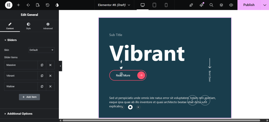
Step 4: Add Your Slides
Once the widget is placed on the page, the Content tab is where you build each slide before turning on the indicators.
- Click Add Item inside the Content tab to create each slide
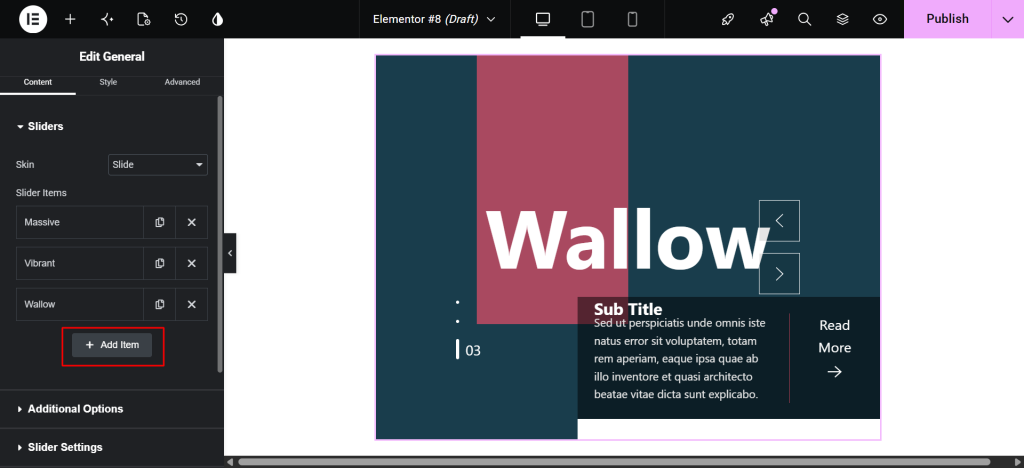
- For each slide, you can configure:
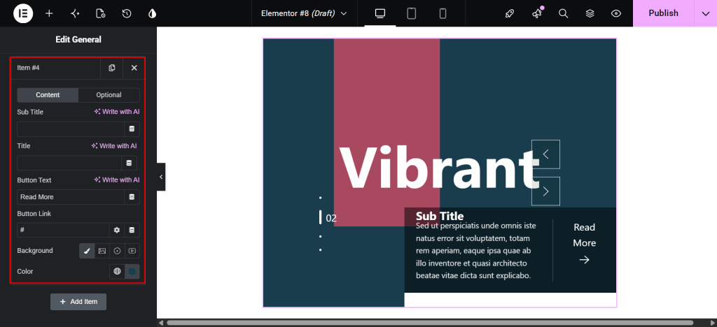
- Background image
- Title and subtitle text
- Excerpt or description
- CTA button text and link
Add at least three slides. Fewer than three carousel navigation indicators make the carousel feel unnecessary, and there isn’t much for users to navigate between.
Step 5: Enable Carousel Indicators
Now that your slides are in place, enabling the indicators themselves is a single toggle inside the same settings panel.
- Stay inside the Content tab and scroll to the slider settings area
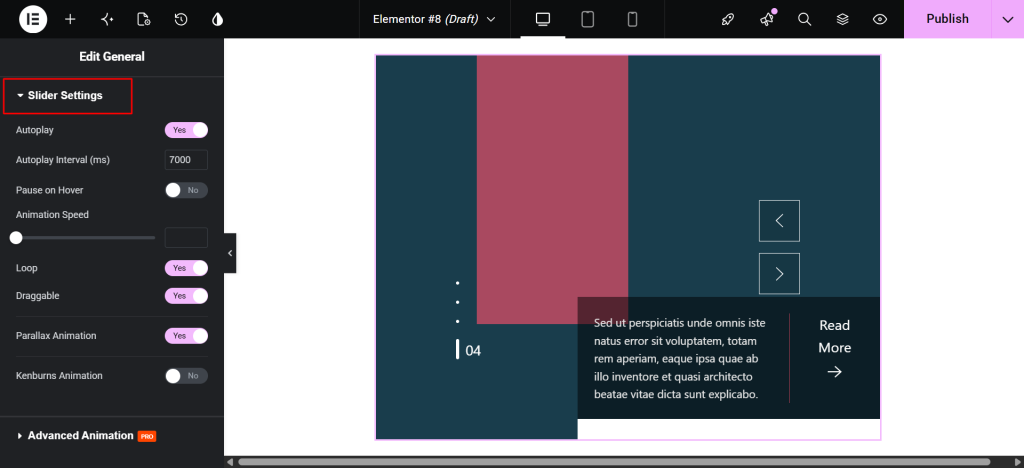
- Autoplay: Enabling this option automatically plays the slides one after another.
- Autoplay Interval (ms): This option lets you set the time delay between each slide transition.
- Pause on Hover: Enable the switcher to pause autoplay when the user hovers over the slider.
- Animation Speed: This option controls how fast the transition animation occurs between slides.
- Loop: Enable the switcher to automatically return to the first slide after the last slide.
- Draggable: Enable the switcher to allow users to manually drag (swipe) slides left/right.
- Parallax Animation: Enable the switcher to add a layered scrolling effect to slider elements.
- Kenburns Animation: Enable the switcher to add a smooth zoom-in/out and pan effect on background images.
This activates the image carousel indicators for your slider.
Depending on the widget, this option may appear as Pagination, Show Pagination, or Pagination Bullets. All Swiper-based Prime Slider widgets follow the same consistent pattern here.
If you want carousel pagination outside the slider itself, the Remote Pagination widget lets you place indicators anywhere on the page and link them to any Swiper-based slider via a shared CSS ID. This is useful for layouts where the indicators need to sit fully outside the slider container.
Step 6: Customize Carousel Indicators
With pagination enabled, the Style tab gives you full control over how the indicators look and how they respond to interactions.
- Switch to the Style tab in the Elementor panel.
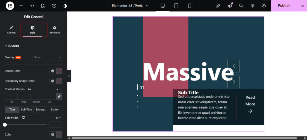
Available options across most widgets include:
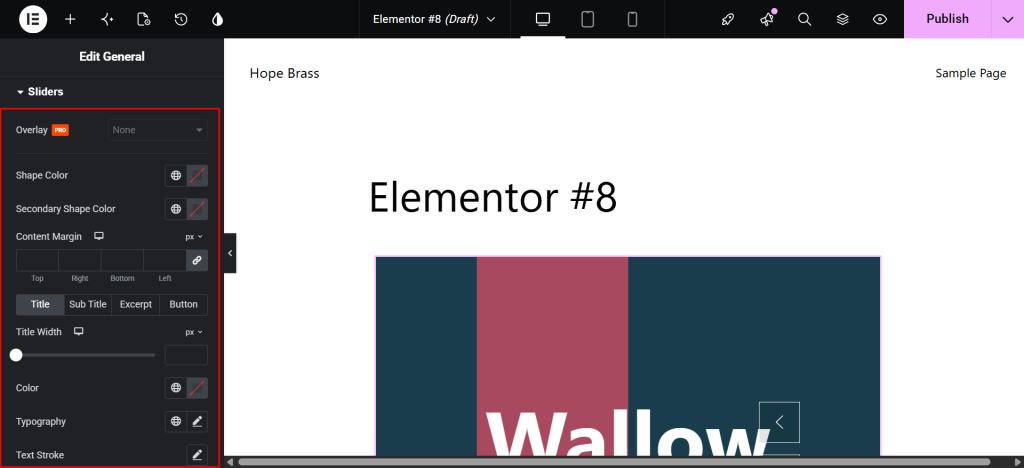
- Pagination Color: Default color for inactive dots
- Active Color: Color of the currently active indicator dot
- Size: Diameter of each dot or indicator element
- Spacing: Gap between individual pagination dots
- Border Type, Width, and Color: Adds outlines to each indicator
- Border Radius: Controls how round or pill-shaped indicators appear
- Padding: Controls inner space within each indicator
- Position or Alignment: Moves indicators left, center, or right
For the Panorama Slider, you also get a Bottom Offset option for vertical positioning and Dynamic Main Bullets to control how many bullets appear around the active indicator at once.
The Super Flow Slider includes a dedicated Spacing field for dot gaps and an Active Color picker.
The Sniper Slider goes further, with a Scrollbar section for line-based indicator styling, featuring its own active and inactive colors.
How to Customize Carousel Indicators for Better Conversions
Getting the indicators to show up is just the first part. How you style and position them directly affects whether users notice and interact with them. Once the basics are working, a few targeted adjustments can meaningfully improve how visitors interact with your responsive carousel indicators:
- Match the active indicator color to your brand’s primary color. A subtle difference in shade between active and inactive dots is not enough. Make it obvious at a glance which slide is the current one.
- Use adequate spacing between dots. Indicators placed too close together are difficult to tap on a mobile. A spacing value between 8px and 12px is a safe starting point for most touchscreen layouts.
- Avoid making indicators too small. Anything under 8px is hard to see on high-resolution screens and nearly impossible to tap reliably on touchscreens. Increase the size if your design allows.
- Position indicators strategically. For hero sections, indicators typically sit below the slide content. For full-screen or overlapping layouts, position them over the image with a strongly contrasting color.
- Consider hiding indicators on mobile when the style does not adapt well. The Monster Slider includes a Pagination Hide on Mobile toggle for exactly this scenario. Relying solely on swipe gestures can actually yield a cleaner mobile experience when dot indicators are too small to be useful.
Best Prime Slider Widgets for Carousel Indicators
Prime Slider includes a large library of widgets, and several of them stand out specifically for how much control they give you over carousel dots and navigation indicators. Here are the three strongest options to consider, depending on your layout and design goals.
1. General Slider
The General Slider is the most versatile starting point for adding WordPress-style carousel dots. It supports four skins, full pagination controls, and works across hero sections, landing pages, and marketing campaigns. If you are new to Prime Slider, start here. For a solid foundation before diving into pagination, the BdThemes guide on creating a slider in Elementor walks through the basics step by step.
Best for:
- Hero sections
- Landing pages
- Marketing banners and campaigns
2. Monster Slider
If your slider is image-heavy or uses a multi-column layout, the Monster Slider gives you both the layout flexibility and the indicator controls you need.
The Monster Slider supports both Carousel and Coverflow layout modes, Color, Active Color, and Size controls for the dots, and a dedicated Pagination Hide on Mobile option. It is a strong fit for post sliders, image carousels, and any multi-column layout where visual content leads the experience.
Best for:
- Image-heavy pages
- Post and blog carousels
- Multi-column content displays
3. Panorama Slider
For designs that require precise control over every aspect of the indicator display, the Panorama Slider is the most capable option in the Prime Slider library.
The Panorama Slider offers the most advanced carousel navigation indicator controls available. Active Bullet Color, Bottom Offset for vertical placement, and Dynamic Main Bullets make it the right choice when your design requires precision. It is particularly effective for full-width hero layouts and visual storytelling.
Best for:
- Full-width hero layouts
- Interactive visual storytelling
- Design-forward landing pages
Prime Slider vs Default Elementor Carousel Indicators
Before committing to any tool, it helps to understand exactly what you are getting compared to what is already available. Here is how Prime Slider stacks up against the default Elementor carousel widget on the features that matter most for pagination and indicator control.
| Feature | Prime Slider | Default Elementor |
| Slider widget variety | 50+ widgets | 1 basic carousel |
| Advanced indicator styling | Yes | Basic only |
| Pre-built slider templates | 99+ | Limited |
| WooCommerce product sliders | Yes | No |
| Remote pagination placement | Yes | No |
| Active dot color control | Yes | No |
| Mobile pagination hide option | Yes | No |
| Elementor native editing | Yes | Yes |
Default Elementor gives you basic carousel dots with minimal styling options.
Prime Slider extends that foundation with per-widget pagination controls, remote placement via the Remote Pagination widget, active state styling, size and spacing controls, and mobile visibility toggles across dozens of slider types.
For a broader side-by-side look at how Prime Slider compares to other Elementor slider plugins on the market, the 10 Best Elementor Slider Plugins breakdown covers features, pricing, and performance in one place.
And if you are building a WooCommerce store alongside your slider work, the best WooCommerce builder plugins for non-developers guide is worth a read for a fuller picture of the available toolkit.
Frequently Asked Questions
What are carousel indicators in WordPress?
Carousel indicators are the navigational elements attached to a slider, usually dots, numbers, or bars, that show users which slide they are on and how many slides exist. They improve navigation and content discovery in any WordPress carousel slider layout.
Can I add carousel indicators without coding?
Yes. Prime Slider handles everything inside Elementor’s visual editor. No custom CSS or PHP is required at any step.
Does Prime Slider support custom indicator styles?
Yes. Most widgets include Color, Active Color, Size, Spacing, Border, Border Radius, and Padding options for their pagination elements. Some widgets, like the Panorama Slider add further controls including Dynamic Main Bullets and Bottom Offset.
Can I customize carousel indicator colors and size?
Yes. The Style tab in the Elementor sidebar gives you separate color pickers for the default and active states, along with size and spacing controls.
Are carousel indicators mobile responsive?
Yes. All Prime Slider widgets are fully responsive. Some, including the Monster Slider, include a dedicated mobile hide option for cases where dots are too small to be useful on touchscreens.
Which Prime Slider widget is best for carousel indicators?
The General Slider is the best starting point for most use cases. The Panorama Slider offers the most advanced pagination controls. The Monster Slider is the strongest choice for image carousels and post sliders.
Do carousel indicators improve user engagement?
Yes. Indicators help users understand that more content exists, increasing the likelihood they will interact with subsequent slides rather than leaving after the first.
Conclusion
Carousel indicators are a small but meaningful addition to any WordPress slider. They remove confusion, encourage content discovery, and give your site a more intentional, polished feel. Without them, even a beautifully designed WordPress image carousel risks being ignored after the first slide.
With Prime Slider, adding and customizing WordPress slider dots, numbered pagination, or advanced bullet indicators takes only a few clicks inside Elementor. No code, no workarounds, and no guessing at settings. Whether you are working on a hero section, a WordPress testimonial carousel, or a full product showcase, the pagination controls are consistent, flexible, and built to match any brand style.
If you are still building out the rest of your Elementor store setup, the Ultimate Store Kit offers eCommerce-specific carousel and slider widgets that pair well with Prime Slider on WooCommerce stores. And if you want to go further with your store design, the guide on how to design a WooCommerce product page that converts is a practical next read.
Ready to get started? Try Prime Slider and build fully customizable sliders with advanced carousel navigation indicators directly inside Elementor.
